
Schoenzeit
Kosmetiksalon in Burgdorf
Projekt info
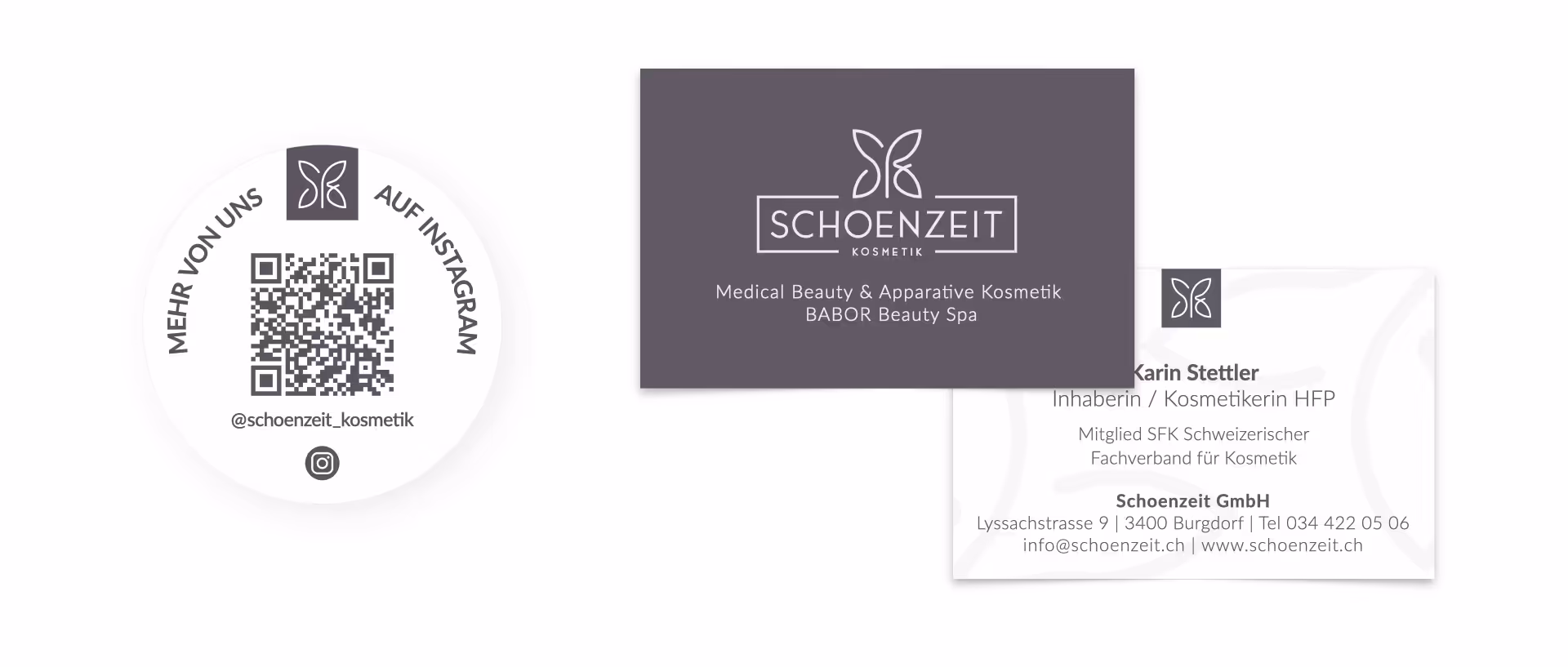
Schoenzeit Kosmetik in Burgdorf verfügte über ein veraltetes Erscheinungsbild und wandte sich mit dem Ziel an mich, eine moderne und elegante Präsenz zu entwickeln – vom Logo und Corporate Design bis hin zur mobilfreundlichen Website.
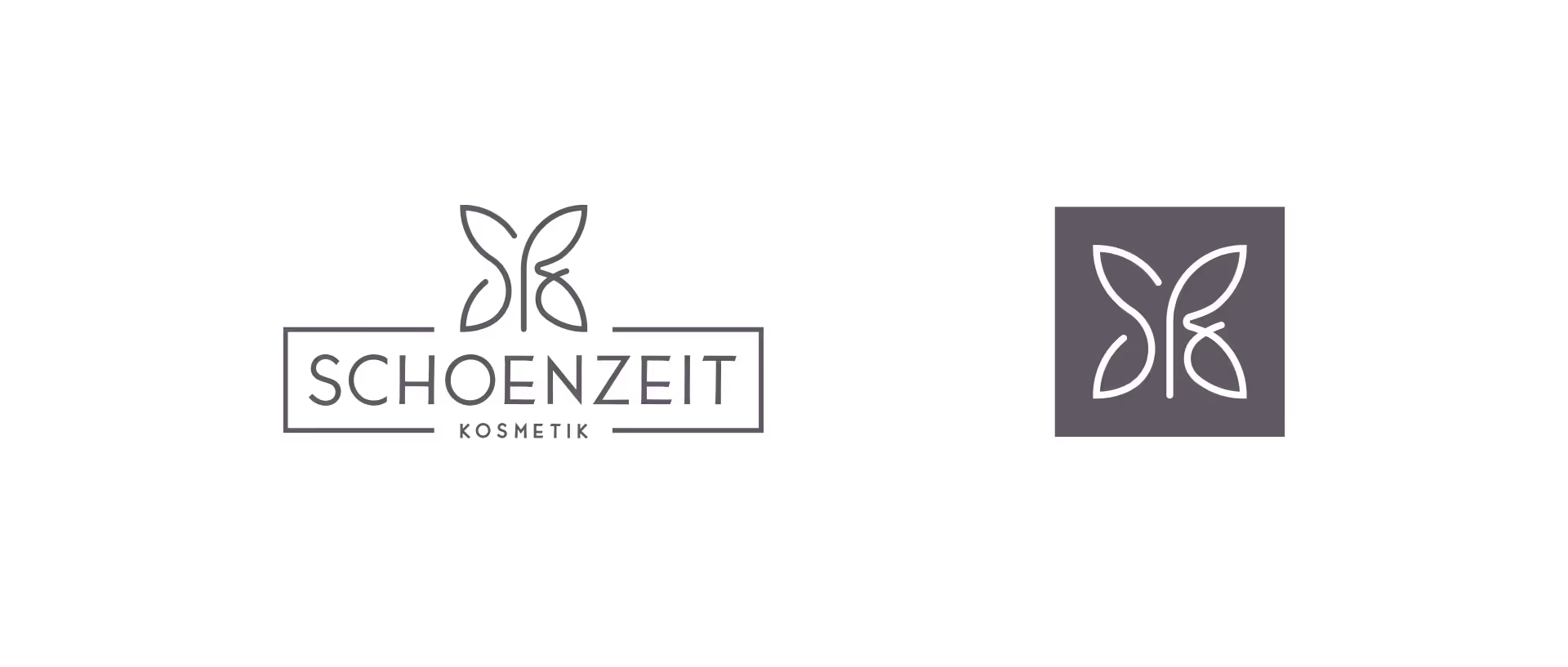
Im Zentrum des Redesigns steht das Logo, das für Transformation und Schönheit steht. Die Schmetterlingsform spiegelt die Markenphilosophie wider: Jeder Mensch kann sich wandeln und erstrahlen. Gleichzeitig sind die Initialen „SZ“ dezent integriert – eine Kombination aus Eleganz und Klarheit.
Die Website stellte eine besondere Herausforderung dar: Das breite Angebot an Behandlungen erforderte eine strukturierte Seitenarchitektur mit klaren Übersichten, flexiblen Detailseiten und anpassbaren Galerien. Das WordPress-CMS wurde speziell so konfiguriert, dass das Team Inhalte selbstständig aktualisieren kann, ohne dabei das konsistente Design zu verlieren.
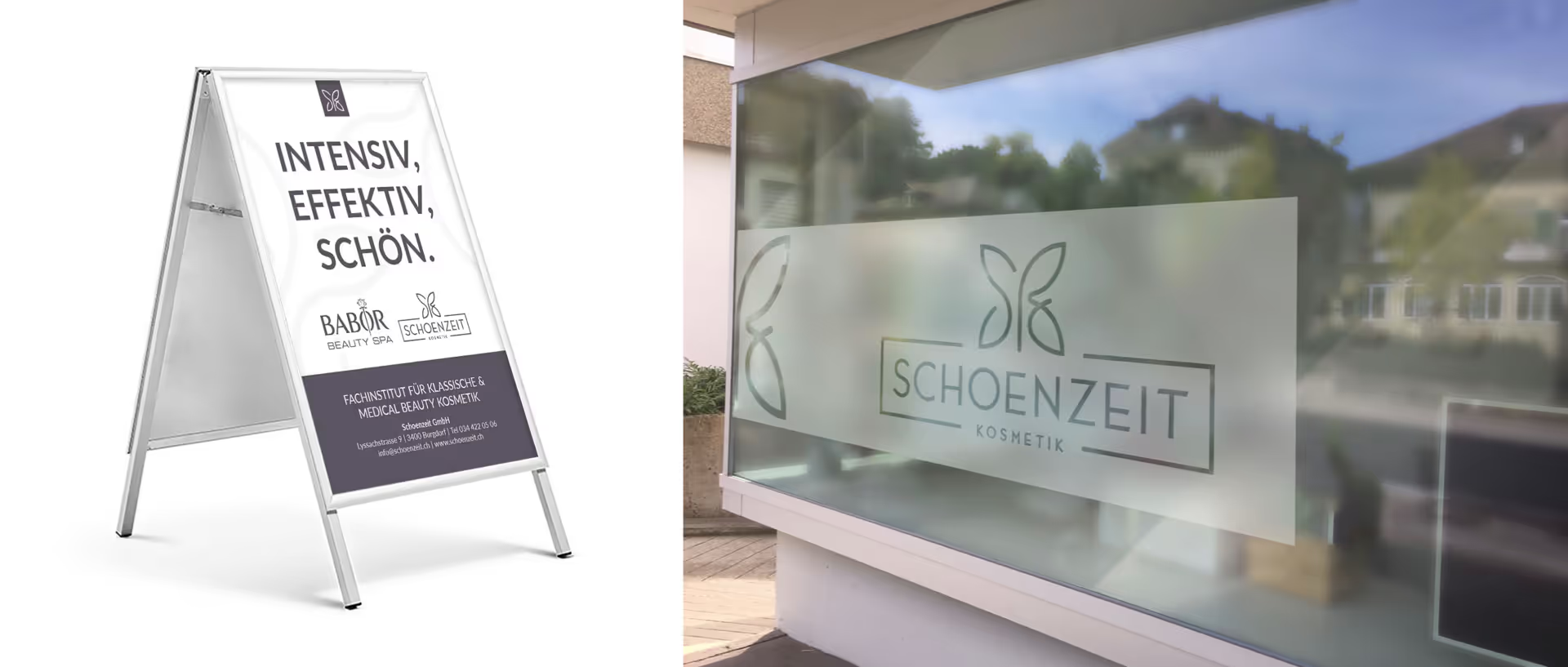
In einem späteren Schritt wurde auch die Schaufenstergestaltung überarbeitet, um das Studio von außen einladender und ansprechender wirken zu lassen.
Das Ergebnis: Ein stimmiges Markenerlebnis, das die hochwertigen Leistungen von Schoenzeit widerspiegelt.
Kunde
Jahr

Logo


Gallery
Videos
Animation
Photography
UX & Web


Kunden
OceanSafe AGUniversität ZürichTouring Club Schweiz (TCS)Spitex Aemmeplus AGKaiser Software GmbHBöhlen LandschaftsbauKollaborationen
Human Front AidUltima Irratio


